
Warrington Colescott, Death in Venice – I Feel Sick, 1971, etching, 16” x 12” Warrington Colescott including the entire Death in
Warrington Colescott, Death in Venice – I Feel Sick, 1971, etching, 16” x 12” Warrington Colescott including the entire Death in

Saturday, November 7th, 2015 6:30PM-10:30PM, One night only! Glasshouse 246 Union Ave Brooklyn, New York 11211 Brooklyn, NY – Authorized

Packet Biweekly is pleased to announce its first ever U-haul Fire Sale at Bushwick Open Studios this Saturday, June 6th

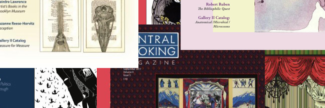
If you’re looking for that perfect present – to yourself as well – why not order a subscription or two to CENTRAL BOOKING Magazine for 2013? ORDER
You receive 4 full color issues at the discounted price of $35, plus ($9 shipping and handling). International orders welcome, too ($16 shipping [...]
Koren Shadmi’s drawing, titled ‘View of The World from Bedford Avenue’ is a homage to the classic New Yorker cover from 1976 by the great Saul Steinberg. The original cover was a visual observation of how New Yorkers see the rest of the world; miniaturized by the grandeur and solipsism of Manhattan, the unofficial center [...]
PINTS N’ PRINTS FIGURE DRAWING
unlimited beer, figure drawing and monoprints from a live costumed model!happening every-other Thursday, 8-10pm at Gowanus Print LabI am intrigued by layers. I relate layers to history. History becomes the vertical layers of a place and use them to investigate spatial depth in my artwork. I want the viewer to become aware of space as layers; to connect with the atmosphere as they move through it; to appreciate how perception of proportion [...]

Linda Tharp – Bloom: paintings and monotypes a solo exhibition at Sweet Lorraine Gallery April 7-29 Reception with wine and